жЁҷжә–гҒҢгӮӯгғўгҒ„гҒЁжҖқгҒҶгҒ®гҒҜгғҜгӮҝгӮҜгӮ·гҒ гҒ‘пјҹгҒқгҒ®пј’
гҒ“гӮ“гҒ«гҒЎгҒҜ
е…ҲйҖұж—Ҙжӣңж—ҘгҒҜд»•дәӢгҖӮ
ж—Ҙжӣңж—ҘгҒҜгғңгӮӨгғ©гғјгҒҢйқһзЁјеғҚгҖӮ
гӮҲгҒЈгҒҰгҖҒе®Өжё©пјҳеәҰгҖӮ
гғһгӮёжӯ»гҒӯгӮӢгҖӮ
гҒ•гҒҰгҖҒд»ҠеӣһгҒҜгҖӮ
гҒҫгҒҹгҒҫгҒҹй–ӢзҷәгғҚгӮҝгҖӮ
й–ӢзҷәгҒЁгҒ„гҒҶгӮҲгӮҠгӮӮгҖҒгҒҠйҒҠгҒігҖӮ
жЁҷжә–гҒ§гӮӯгғўгҒ„гғңгӮҝгғігӮ’гҒӘгӮ“гҒЁгҒӢгҒҷгҒ№гҒҸгҖҒгӮігғігғҲгғӯгғјгғ«гғҶгғігғ—гғ¬гғјгғҲгӮ’дҪңжҲҗгҒ—гҒҹгҒҢгҖҒеүҚеӣһгҒҜжҳјдј‘жҶ©гҒҢзөӮдәҶгҒ—гҒҹгҒҹгӮҒжҷӮй–“еҲҮгӮҢгҖӮ
жң¬ж—ҘгҒҜгҒқгӮҢгӮ’гӮ«гӮ№гӮҝгғ гӮігғігғҲгғӯгғјгғ«еҢ–гҒ—гҒҹгҖӮ
гҒ“гӮҢгҒ§гғ©гӮӨгғ–гғ©гғӘгҒЁгҒ—гҒҰд»–гҒ®й–ӢзҷәгҒӢгӮүгҒ§гӮӮеҲ©з”ЁеҸҜиғҪгҖӮ
гҒ“гӮ“гҒӘгғңгӮҝгғідёҖгҒӨиӘ°гҒҢдҪҝгҒҶгҒӯгӮ“www
гҒҫгҒҡгҒҜе®ҢжҲҗгҒ®еӣі
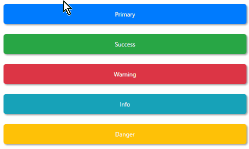
гғңгӮҝгғігҒ®еӢ•дҪңгҒҜгғһгғҶгғӘгӮўгғ«гғҮгӮ¶гӮӨгғігӮ’еҸӮиҖғгҒ«гҖӮ
гғңгӮҝгғігҒ®гӮ«гғ©гғјгҒҜBootstrap4гӮ’еҸӮиҖғгҒ«гҖӮ
е‘ҪеҗҚгҖҢBootMaterialButtonгҖҚ
гӮӯгғўгҒ•и»ҪжёӣгҒ§гҒҚгҒҹwwwww
д»ҠеӣһгҒҜгҖҒеүҚеӣһгҒ®гӮӮгҒ®гҒ«еҠ гҒҲгҒҰи§’гҒ®дёёгӮҒе…·еҗҲгӮ’иҝҪеҠ гҖӮ
гӮ«гӮ№гӮҝгғ гӮігғігғҲгғӯгғјгғ«XAML
гӮ«гӮ№гӮҝгғ гӮігғігғҲгғӯгғјгғ«гҒ«гҒҷгӮӢгҒ«гҒӮгҒҹгӮҠгҖҒгғ—гғӯгғ‘гғҶгӮЈгҒ®гғҗгӮӨгғігғүгӮ’иҝҪеҠ гҒ—гҒҰгҒ„гӮӢгҖӮ
ControlTemplate
<Grid Margin="5">
    <Border
        Name="Border"
        Panel.ZIndex="0"
        Background="{TemplateBinding DefaultBackgroundColor}"
        BorderBrush="{TemplateBinding DefaultBorderColor}"
        BorderThickness="{TemplateBinding BorderThickness}"
        CornerRadius="{TemplateBinding CornerRadius}">
        <Border.Effect>
            <DropShadowEffect
                x:Name="Shadow"
                BlurRadius="5"
                Direction="315"
                Opacity="0.5"
                ShadowDepth="3"
                Color="Gray" />
        </Border.Effect>
    </Border>
    <Border
        Name="BorderWhite"
        Panel.ZIndex="1"
        Background="White"
        BorderBrush="Transparent"
        BorderThickness="0"
        CornerRadius="{TemplateBinding CornerRadius}"
        Opacity="0" />
    <Border
        Name="BorderContent"
        Panel.ZIndex="2"
        Background="Transparent"
        BorderBrush="Transparent"
        BorderThickness="0"
        CornerRadius="{TemplateBinding CornerRadius}"
        FocusManager.FocusedElement="{Binding ElementName=contentPresenter}">
        <ContentPresenter Name="contentPresenter" />
    </Border>
</Grid>

<ControlTemplate.Triggers>
    <Trigger Property="IsFocused" Value="True">
        <Setter TargetName="Border" Property="Background" Value="{Binding RelativeSource={RelativeSource TemplatedParent}, Path=FocusedBackgroundColor}" />
    </Trigger>
    <Trigger Property="IsEnabled" Value="False">
        <Setter TargetName="Border" Property="Background" Value="{Binding RelativeSource={RelativeSource TemplatedParent}, Path=DisabledBackgroundColor}" />
    </Trigger>
    <Trigger Property="IsEnabled" Value="False">
        <Setter TargetName="Border" Property="Background" Value="{Binding RelativeSource={RelativeSource TemplatedParent}, Path=DisabledBackgroundColor}" />
    </Trigger>

    <Trigger Property="IsMouseOver" Value="True">
        <Trigger.EnterActions>
            <BeginStoryboard>
                <Storyboard>
                    <DoubleAnimation
                        Storyboard.TargetName="BorderWhite"
                        Storyboard.TargetProperty="Opacity"
                        To="0.3"
                        Duration="0:0:0.3" />
                    <DoubleAnimation
                        Storyboard.TargetName="Shadow"
                        Storyboard.TargetProperty="Opacity"
                        To="0.8"
                        Duration="0:0:0.3" />
                </Storyboard>
            </BeginStoryboard>
        </Trigger.EnterActions>
        <Trigger.ExitActions>
            <BeginStoryboard>
                <Storyboard>
                    <DoubleAnimation
                        Storyboard.TargetName="BorderWhite"
                        Storyboard.TargetProperty="Opacity"
                        To="0"
                        Duration="0:0:0.3" />

                    <DoubleAnimation
                        Storyboard.TargetName="Shadow"
                        Storyboard.TargetProperty="Opacity"
                        To="0.5"
                        Duration="0:0:0.3" />
                </Storyboard>
            </BeginStoryboard>
        </Trigger.ExitActions>
    </Trigger>
</ControlTemplate.Triggers>гӮ«гӮ№гӮҝгғ гӮігғігғҲгғӯгғјгғ«гӮҜгғ©гӮ№
гӮөгӮҜгғғгҒЁVBгҒ§д»ҘдёӢгҒ®гғ—гғӯгғ‘гғҶгӮЈгӮ’дҪңжҲҗгҖӮ
гғ»DefaultBackgroundColor
гғ»DefaultBorderColor
гғ»FocusedBackgroundColor
гғ»DisabledBackgroundColor
гғ»CornerRadius
гғ“гғ«гғүгҒҷгӮҢгҒ°DLLгҒЁгҒ—гҒҰдҪңжҲҗгҒ•гӮҢгӮӢгҖӮ
дҪңжҲҗгҒ—гҒҹгӮ«гӮ№гӮҝгғ гӮігғігғҲгғӯгғјгғ«гӮ’дҪҝгҒҶ
гғ»гғ—гғӯгӮёгӮ§гӮҜгғҲгҒ®еҸӮз…§иЁӯе®ҡгҒ«дҪңжҲҗгҒ—гҒҹпјӨпј¬пј¬гӮ’иҝҪеҠ

гғ»гӮігғігғҲгғӯгғјгғ«гӮ’дҪҝз”ЁгҒҷгӮӢXAMLгҒ®еҸӮз…§гӮ’иҝҪеҠ
xmlns:controls="clr-namespace:OriginalControl;assembly=OriginalControl"гғ»гғӘгӮҪгғјгӮ№гҒ«гӮ№гӮҝгӮӨгғ«е®ҡзҫ©гӮ’иҝҪеҠ
<!--  Primary  -->
<Style x:Key="OriginalButtonStylePrimary" TargetType="controls:OriginalButton">
    <Setter Property="DefaultBackgroundColor" Value="#007bff" />
    <Setter Property="Foreground" Value="White" />
    <Setter Property="CornerRadius" Value="5" />
</Style>

<!--  Success  -->
<Style x:Key="OriginalButtonStyleSuccess" TargetType="controls:OriginalButton">
    <Setter Property="DefaultBackgroundColor" Value="#28a745" />
    <Setter Property="Foreground" Value="White" />
    <Setter Property="CornerRadius" Value="5" />
</Style>

<!--  Danger  -->
<Style x:Key="OriginalButtonStyleDanger" TargetType="controls:OriginalButton">
    <Setter Property="DefaultBackgroundColor" Value="#ffc107" />
    <Setter Property="Foreground" Value="White" />
    <Setter Property="CornerRadius" Value="5" />
</Style>

<!--  Warning  -->
<Style x:Key="OriginalButtonStyleWarning" TargetType="controls:OriginalButton">
    <Setter Property="DefaultBackgroundColor" Value="#dc3545" />
    <Setter Property="Foreground" Value="White" />
    <Setter Property="CornerRadius" Value="5" />
</Style>

<!--  Info  -->
<Style x:Key="OriginalButtonStyleInfo" TargetType="controls:OriginalButton">
    <Setter Property="DefaultBackgroundColor" Value="#17a2b8" />
    <Setter Property="Foreground" Value="White" />
    <Setter Property="CornerRadius" Value="5" />
</Style>гғ»гғңгӮҝгғігӮ’й…ҚзҪ®
<controls:OriginalButton
    Height="50"
    Margin="5"
    Style="{StaticResource OriginalButtonStylePrimary}">
    <TextBlock
        HorizontalAlignment="Center"
        VerticalAlignment="Center"
        Text="Primary" />
</controls:OriginalButton>

<controls:OriginalButton
    Height="50"
    Margin="5"
    Style="{StaticResource OriginalButtonStyleSuccess}">
    <TextBlock
        HorizontalAlignment="Center"
        VerticalAlignment="Center"
        Text="Success" />
</controls:OriginalButton>

<controls:OriginalButton
    Height="50"
    Margin="5"
    Style="{StaticResource OriginalButtonStyleWarning}">
    <TextBlock
        HorizontalAlignment="Center"
        VerticalAlignment="Center"
        Text="Warning" />
</controls:OriginalButton>

<controls:OriginalButton
    Height="50"
    Margin="5"
    Style="{StaticResource OriginalButtonStyleInfo}">
    <TextBlock
        HorizontalAlignment="Center"
        VerticalAlignment="Center"
        Text="Info" />
</controls:OriginalButton>

<controls:OriginalButton
    Height="50"
    Margin="5"
    Style="{StaticResource OriginalButtonStyleDanger}">
    <TextBlock
        HorizontalAlignment="Center"
        VerticalAlignment="Center"
        Text="Danger" />
</controls:OriginalButton>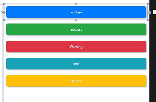
гҒ“гӮ“гҒӘгҒөгҒҶгҒ«й…ҚзҪ®гҒ•гӮҢгӮӢгҖӮ
гҒҫгҖҒгҒ“гӮ“гҒӘж„ҹгҒҳгҒӢгҖӮ
гӮ«гғ©гғје®ҡзҫ©гҒҜгғ—гғӯгғ‘гғҶгӮЈгҒ«гҒҷгӮҢгҒ°гҒ„гҒ„гҒӢгҒЁжҖқгҒЈгҒҹгҒҢгҖҒгҒӮгҒҫгӮҠгӮ¬гғҒгӮ¬гғҒгҒ«гҒ—гҒҰгҒ—гҒҫгҒҶгҒЁеҫҢгҒ§еҝңз”ЁгҒ§гҒҚгҒҡеӣ°гӮӢгҒ®гҒ§еҚҙдёӢгҖӮ
гӮ№гӮҝгӮӨгғ«гҒЁгҒ—гҒҰе®ҡзҫ©гҒҷгӮӢгҒ“гҒЁгҒ«гҒ—гҒҹгҖӮгӮ№гӮҝгӮӨгғ«е®ҡзҫ©гҒҜгӮ·гӮ№гғҶгғ гҒ«еҗҲгӮҸгҒӣгҒҰе…ұйҖҡгғӘгӮҪгғјгӮ№гғ•гӮЎгӮӨгғ«гӮ’дҪңгӮӢгҒЁжҘҪгҒ гӮҚгҒҶгҖӮ
д»ҠеӣһгҒҜгҖҒгғңгӮҝгғігҒ«еӢ•дҪңгӮ’д»ҳгҒ‘гҒҰгҒ„гҒӘгҒ„гҒ®гҒ§гҖҢCommandгҖҚгғ—гғӯгғ‘гғҶгӮЈгҒҜз©әгҒЈгҒҪгҖӮ
гҒӣгҒЈгҒӢгҒҸдҪңгӮӢгҒ®гҒ«гҖҒгҒӘгӮ“гҒ гҒӢгҒ•гҒҝгҒ—гҒ„гҒӯгҖӮ